Linus Lohoff
1985-Present
1985-Present
Linus Lohoff is an Art director and Photographer based in Barcelona, Spain. He is Brazilian and was born in Germany, but he currently lives in Spain. Linus has been doing photography since he was 18. After his education as a technical assistant for communication and media, he began to study communication Design at the University of Aplied Sciences in Düsseldorf, Germany, in 2006. He studied abroad in the following years at BAU. He then completed a six-month internship at the music magazine INTRO in Cologne at the graphics and photo department.
Linus has an interesting style. Many of his photos are simple, but they are very clean and crisp with a message. He uses bright solid colors, like neon yellow and blue. He also has many photos with simple geometric shapes, with shadows creating a cool effect on the simple background. However, some of his series have black backgrounds with bright objects that pop. Many of his photographs are kind of Random, but they really make you think hard about what they mean. He says, "I cut out all unnecessary things in a photograph and want to show the essence of the idea."
Linus Lohoff's photography has social meaning. He is showing how simple hand signs can have lots of meaning and spark emotions. When you look at a person holing up a peace sign, you automatically think about peace and hope in the world. When you look at a rock n' roll hand, you think of partying and rebelling. Finally, when you look at a the Vulcan solute, you think about star treck. All these signs can mean different things to different people, depending on their experiences.
Linus has influenced my work very much. He uses bright, solid colors, which I think looks very nice. So, recently, I have been using bright solid colors as well. His photographs are also very simplistic, which I think looks really cool. I think the simple look is really nice, and it has meaning too. I have made sure to try and use his ideas so my photographs can be improved and more interesting.
|
Linus Lohoff
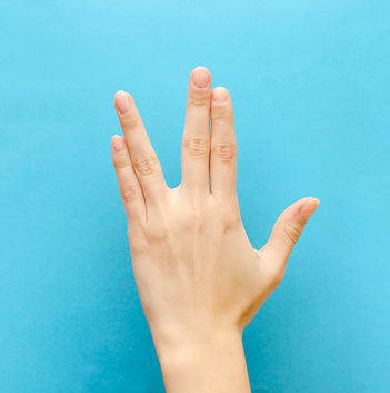
Untitled
|
My work
Go crazy
|
Compare and contrast:
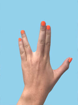
I have made this photograph very similar to Linus'. We both have blue backgrounds, and the hands are in the same position. However, you can tell that Linus used a studio, because the hands are brighter than mine. I took my photos outside with no artificial light, so my hands look darker since the light is coming from the sun. Also, the model here didn't have their nails painted, but I wanted to add some spice so I painted mine orange.
I have made this photograph very similar to Linus'. We both have blue backgrounds, and the hands are in the same position. However, you can tell that Linus used a studio, because the hands are brighter than mine. I took my photos outside with no artificial light, so my hands look darker since the light is coming from the sun. Also, the model here didn't have their nails painted, but I wanted to add some spice so I painted mine orange.
Artist statement:
I call this picture "Go Crazy" because of the crazy shape I had to make with my hands. Whenever I see this hand pose, I think of being crazy or funky. For this photograph, I used the colors blue and orange. I think they contrasted really well. For the background, I kept it plain blue so the hand would pop more. I had to make a weird shape with my hands, so they looked the same as in the original photograph.
I call this picture "Go Crazy" because of the crazy shape I had to make with my hands. Whenever I see this hand pose, I think of being crazy or funky. For this photograph, I used the colors blue and orange. I think they contrasted really well. For the background, I kept it plain blue so the hand would pop more. I had to make a weird shape with my hands, so they looked the same as in the original photograph.
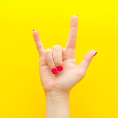
Untitled
|
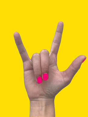
Rock on
|
Artist statement:
I call this photo, "Rock on". Whenever I see someone doing this with their hands, I think about being a rebel and rock music. The colors I used are very bright and contrasting. This makes the hand "pop" and adds to the name. The background is very simple, which also makes the hand stand out. The picture is very balanced, because the hand is centered.
I call this photo, "Rock on". Whenever I see someone doing this with their hands, I think about being a rebel and rock music. The colors I used are very bright and contrasting. This makes the hand "pop" and adds to the name. The background is very simple, which also makes the hand stand out. The picture is very balanced, because the hand is centered.
Compare and Contrast:
This is the second photo I have recreated of Linus'. I tried my best to make it look as similar as possible. I used a yellow background, and did the same hand pose. Since my nails were painted orange, I had to use photoshop to color my nails pink. I think these turned out really similar, considering the fact that I had to paint my nails in photoshop. Again, my hands turned out darker because I was outside and not in a studio.
This is the second photo I have recreated of Linus'. I tried my best to make it look as similar as possible. I used a yellow background, and did the same hand pose. Since my nails were painted orange, I had to use photoshop to color my nails pink. I think these turned out really similar, considering the fact that I had to paint my nails in photoshop. Again, my hands turned out darker because I was outside and not in a studio.
Untitled
|
Peace out
|
Artist statement:
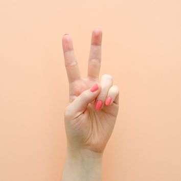
I call this piece, "Peace out" because this is a photograph of the peace sign. Whenever I look at this, I think about peace and hope for the world. I think the colors of the nails and the background compliment each other really well. The picture is balanced because the hand is centered in the middle of the photograph. Because of how nicely everything fits together in this picture, this is my favorite out of all the ones I have recreated.
I call this piece, "Peace out" because this is a photograph of the peace sign. Whenever I look at this, I think about peace and hope for the world. I think the colors of the nails and the background compliment each other really well. The picture is balanced because the hand is centered in the middle of the photograph. Because of how nicely everything fits together in this picture, this is my favorite out of all the ones I have recreated.
Compare and Contrast:
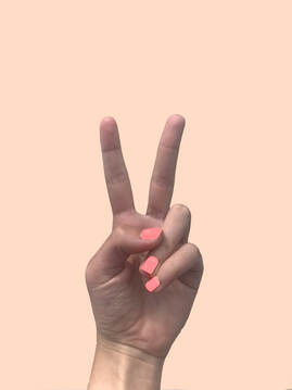
This is the final photograph that I have recreated of Linus'. This one was the hardest to complete. For this, I had to make sure my fingers were in the perfect position so it looked the same. Again, my hands look lot darker, since I didn't have a light and I was just using the light from the sun. I also had to edit my nails for this one, since they were orange in real life. I made sure to add the shine and shadows, and I think it turned out really well. This one is my favorite out of all the pictures I have recreated.
This is the final photograph that I have recreated of Linus'. This one was the hardest to complete. For this, I had to make sure my fingers were in the perfect position so it looked the same. Again, my hands look lot darker, since I didn't have a light and I was just using the light from the sun. I also had to edit my nails for this one, since they were orange in real life. I made sure to add the shine and shadows, and I think it turned out really well. This one is my favorite out of all the pictures I have recreated.
Source for all photographs:
http://linuslohoff.com/
Sources
https://www.majesticjournal.com/linus-lohoff
https://www.flickr.com/people/linuslohoff/
http://linuslohoff.com/
http://linuslohoff.com/
Sources
https://www.majesticjournal.com/linus-lohoff
https://www.flickr.com/people/linuslohoff/
http://linuslohoff.com/
